by Alan Longhurst
Recipe for Australia’s climate ‘truth bomb’: dubious manipulations of the historical temperature record, ignorance of the climate dynamics of the Southern Hemisphere, and ignorance of Australia’s ecological and social history.
A correspondent of The Guardian newspaper writes that her personal ‘climate truth bomb’ hit her while she was picking ash from her glass at a wine tasting event – the Sydney Harbour bridge being dimly seen through the murk of bushfires. The truth came to her, she wrote, in the eloquent rage of Greta Thunberg and also in heat, smoke and fire.
Although anthropogenic climate change sells well, especially at The Guardian, their Sydney correspondent cannot be so ignorant about the climate of Australia or about bushfires as she pretends. Put briefly, bushfires in Australia and elsewhere have two main sources: from thunderstorms or from human activity, deliberate or otherwise – cigarette butts, sparks from brakes on railway trains, from incautious welding on farm machinery and from electric transmission lines. In California, where almost 2 million acres burned in 2018 and claimed many lives, the electricity supply company now closes down its transmission lines in windy conditions to prevent sparking and fires.
As she should have known, climate change or not, that ash in The Guardian correspondent’s wine was very probably caused by the direct action of an Australian citizen. In the current drought, 36% of fires have been judged to be accidental, 37% as suspicious, 13% as deliberate and only 6% as natural. And that pattern is not new: Australia has a serious arson problem. “In short, up to 85 bushfires begin every day because someone leaves their house and decides to start one,” said Dr. P. Reid of the Australian Center for Research in Bushfires and Arson
The geography of the Australian continent is a special case, fire-wise. It has very flat terrain without major mountain ranges, and no major gulfs to allow marine weather to penetrate inland. The pattern of rainfall is driven by the wind systems over the surrounding oceans: Pacific, Indian, Southern. The strength of the SE Trades across the breadth of the Pacific Ocean, and the moisture they transport, are paramount for rainfall in Queensland. But periodically the trades fail during Niño events and so rainfall is intermittent and decade-long dry periods are the rule rather than the exception, especially in the eastern part of the continent.
In New South Wales and Victoria, rainfall variability is also influenced by the dynamics of the Antarctic Ocean, with blocking highs developing over the ocean; in western Australia, the dynamics of the Indian Ocean are important in carrying moisture to the continent. But, overall, the ‘canonical driver of Australian rainfall’ is the alternating state of the SE Trades, according to Risbey and his colleagues. So periodic droughts, more frequent in the east, are the inevitable consequence of Australian geography.
The indigenous vegetation and fauna was evolved to deal with these conditions and the pre-settlement human population had, likewise, evolved a lifestyle that placed sufficiently modest demands on the environment that their survival was assured. This included lighting seasonal ‘cool’ fires that prevented the build-up of dead vegetation and produced a mosaic of burned and unburned land: this technique has now been reintroduced in the Kimberly region and ‘right across the North’ [link]
But the wave of settlement during the 19th century by European pastoralists, who did not understand their new environment, changed all that very fundamentally: ‘sheep were cheap, water was available and graziers relied on saltbush and scrub to provide quality feed when overgrazing had destroyed the perennial grass [link] Rabbits, naively introduced in 1859, were in plague numbers over most of southeast Australia by the end of the century – busily digging out the roots of native vegetation, and ring-barking shrubs. After logging, the regenerating eucalypt woodlands lacked (and much still lacks) a closed canopy, a condition which encourages dry, shrubby ground cover and the propagation of fire.
In short, settlement was disastrous for the original drought-adapted environment of the interior of Australia and it was not long before the inevitable occurred, even without the help of rabbits. Since reliable records began to be kept, a ‘severe’ drought has been recorded on average every 18 years, since that of 1803 which caused crop failures in New South Wales: each was accompanied by widespread bushfires.
The years 1871, 1895-1902, 1926, 1928, 1931, 1939, 1982 and 2009 each have their own Black day-of-the-week and notable high temperatures: the Black Friday fire of February 1931 burned 5 million ha. or 25% of the state of Victoria, claiming 12 lives, plus a million sheep and many cattle.
Images of dead stock and advancing dust-storms abound from those years, local newspapers headlined maximum temperatures and wrote of hardship and abandoned farms; trains were immobilised by dust storms having updrafts so strong that they emitted ball lightning. Conditions during the Federation drought of 1895-1903 were very severe indeed, and a land surveyor recorded that he feared the heat would cause the mercury bulb of his thermometer to burst.
Today, it is widely believed in Australia that the drought and fire-storms of 2019 were the consequence of CO2-driven anomalously high air temperature; long forgotten is the fact that very high temperatures were reliably recorded during earlier droughts. During the Millennium drought of south-eastern regions from 1996 to 2010, the highest temperature recorded at Melbourne was 46.4oC in February 2009 – but on Black Thursday of 1851 Melbourne recorded 117oF (47oC) and on Black Friday of 1939 the same place recorded 45oC.
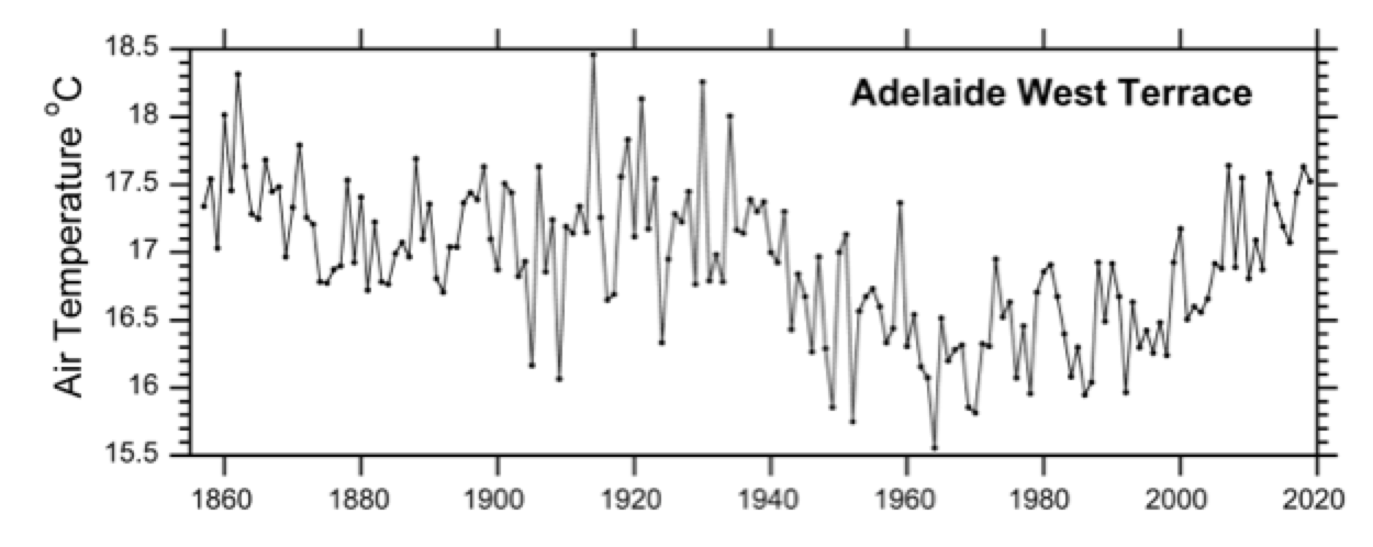
These are conditions sufficiently similar to those of the recent drought as not to make a great deal of difference to those enduring them: that is a strong statement, but it is supported by the Australian network of meteorological observations, which has a spatial coverage second only to that of the USA – and includes stations having continuous data since the 1880s. Observations were established in the early years of the Federation along with the telegraph network, and Australia boasts one of the very longest continuous records globally: observations in Adelaide began in 1856, but you will find the early data have been expunged from the currently-used Australian archives.
Note: The GHCN data is used in this text to avoid the consequences of the post-hoc adjusting of the observations by NOAA, NASA and by the Australian BOM, discussed below.
Until recently, these observations were made at West Terrace which is a large well-grassed city park with botanic gardens, open to the four winds. The station was moved 3.5 km in 1979.
Observations were obtained with mercury thermometers in Gleisher frames or Stevenson screens up to about 1910, although in some outback locations there was probably some improvisation: Stevenson screens became standard after 1910 right up to the progressive introduction of electronic sensors in the 1990s. A comparison showed that Stevenson temperatures were 0.5-1.00C warmer during daytime than in the better-ventilated Gleisher frames: night temperatures were identical in both, winter daytime differences being about half of those of summer. [link]
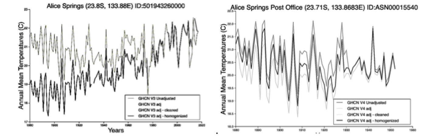
There has been much reluctance to accept the validity of data from the period prior to 1910, when Stevenson screens came to be used everywhere, and this example from NASA Goddard (copied about two years ago) shows an astonishing solution: adjust the earliest homogenised (black line) observations by -3oC and progressively decrease this offset until the adjusted data become compatible with the unadjusted observations (grey line).
Fortunately, perhaps because of the support given by many other rural data to the original observations, NASA seems to have come to its senses since then, and now in 2020 (right plot) offers a more sensible interpretation that accepts the original data as having been correct. But this now contradicts the interpretation of the Alice Springs observations by the Australian Bureau of Meteorology (BOM) in their much-criticised ACORN-SAT archive (to be discussed later).
The problematic air temperature data
A common feature of the reporting of the recent drought has been an insistence that air temperatures have been anomalously high because of CO2-forced warming of the lower atmosphere; however, the original observations – prior to processing by some US and UK agencies – do not always concur.
Australia, like all nations, submits its observations annually to WMO for archiving, whence they are obtained by the US/NOAA National Climatic Data Centre and incorporated into a Global Historical Climate Network (GHCN); they become accessible also from US/NASA Goddard as the GISTEMP (global) data set and from the Hadley Centre of the UK Meteorological Office as the CRUTEM data set. Unfortunately there has been much informal grumbling that homogenisation of individual data with neighbours, and adjustment for instrument moves were not being performed rationally either by Goddard or the CRU. The processed data have a warming trend consistently stronger than in the original data submitted by nations, and as originally archived as the GHCN. The GHCN, GISTEMP and CRUTEM data have become the workhorses of climate change studies, and much hangs on their being correct.
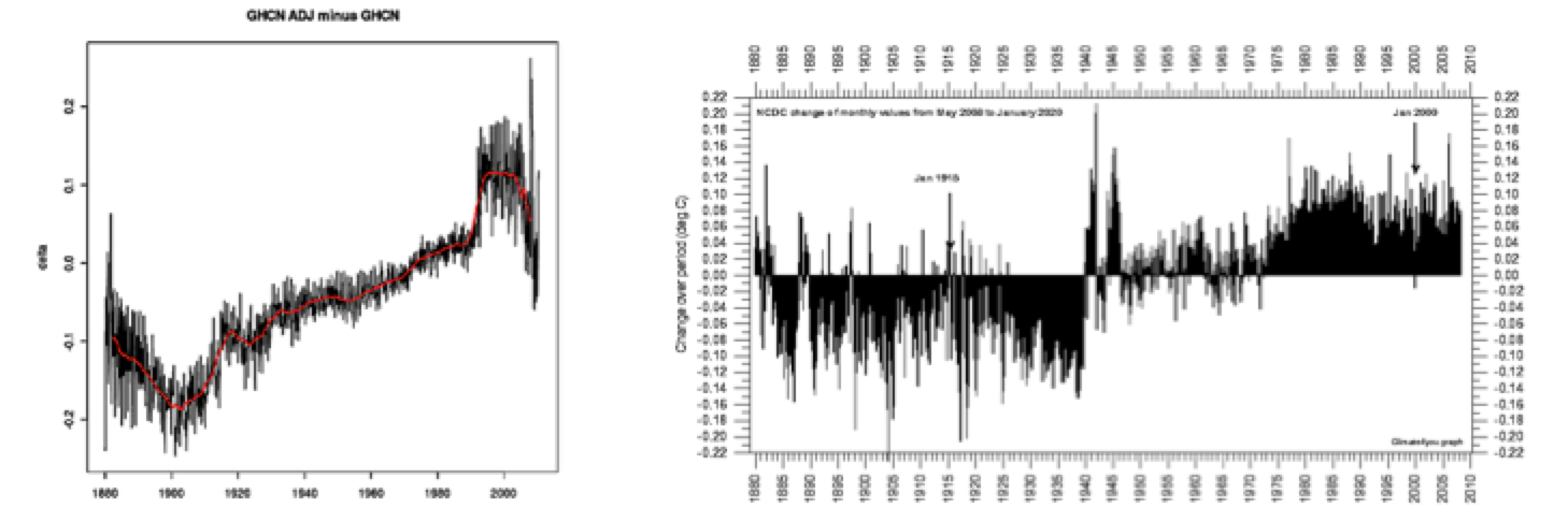
To address this issue, Ross McKitrick compared all raw and adjusted GHCN data in grid-cells in which both adjusted and unadjusted data were present and found that for all years up to about 1980, the adjustments resulted in a temperature cooler than the observations, but in later years corrections tended to be in the opposite sense (delta T 0C, y-axis in left image below). The unavoidable consequence is that ‘a portion of the warming trend shown in global records derived from the adjusted GHCN archive results from the adjustments and not from the underlying data’.
These adjustments collectively increase the 20th century warming by 0.3-0.40C over the observations. This finding was confirmed independently and published informally by others (right, above) [link] The left-hand figure above results because the code used at NCDC/GHCN and at NASA/GISS to correct for terminal warming caused by urban or similar effects should be designed to cool the terminal, urbanised section of the record – but, instead of doing this, the code warms the earlier segments so as to bring the the record into proper alignment. This inversion of the appropriate correction is not only counter-intuitive but it enables the final temperature due to urban effects to be treated subsequently as “normal”. [link]
Fortunately, the original observations as submitted by national agencies to WMO are archived by NOAA’s National Climate Data Center at U. Alabama and these have suffered only very light post-accession processing: they are the closest we can now get to the original observations and are a solid foundation for regional climate analysis: these data are available without fuss at the KNMI site as the GHCN.all file and are used in what follows.
This finding is consistent with a computation of the degree to which the pattern of trends in a homogenised, gridded data set is independent of socio-economic factors: this hypothesis is rejected (P = 7.1 x 10⁻¹⁴) across a grid of all land-based grid cells. This means “that extraneous (non-climatic) signals contaminate gridded climate data”, the consequence of which is that the estimated 1980-2002 global mean temperature trend must be reduced by about half, if it is used to monitor natural or CO2 induced climate change. [link]
The contiguous USA is the only large region which is covered with a satisfactorily dense network of stations, satisfactorily managed: here are the annual mean surface temperatures from the unedited GNCN archive: it offers very little support for the standard plot of the evolution of surface temperature. If we had similar data at global and secular scale there would be much less debate about the nature of climate evolution.
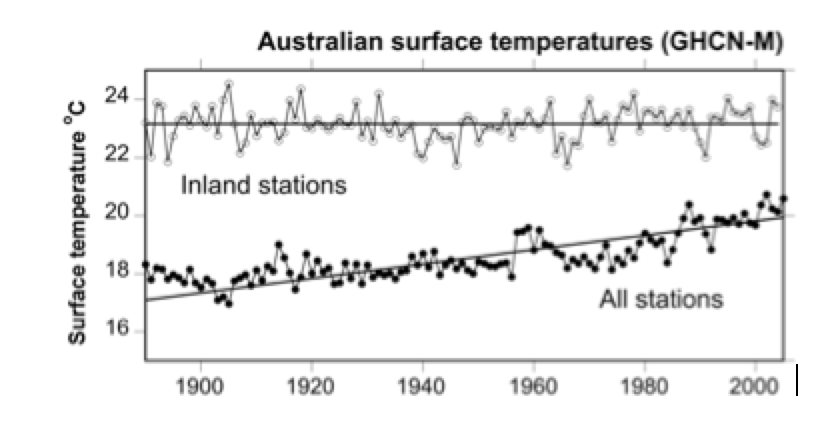
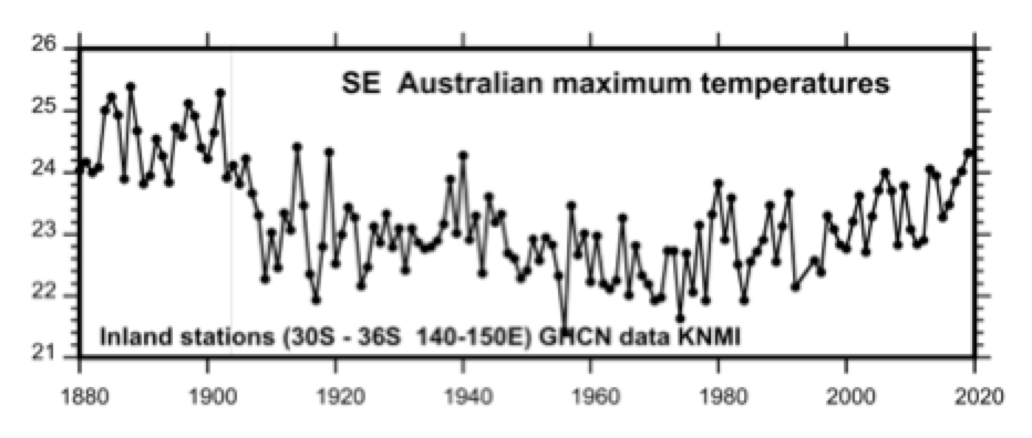
Fortunately, Australia has a coverage of rural data second only to the USA and these may be used to demonstrate the consequences of the fact that most Australians live on, on near the coastline, while few live in the interior of the continent. The relatively lightly-edited GHCN-all data from KNMI show temperature trends from all Australian stations within each of two rectangles: (1) 20o-29.5oN 125o-145oE representing inland regions, and (2) 10oS-40oS 105oE-155oE that includes all of Australia and thus all Australian cities and large towns with very few exceptions.
The effect of the growth of the urban, coastal population, that started seriously around 1900 after the gold rush, is very clear: an almost linear warming trend in which nights once again warm faster than days. In the rural regions, air temperatures exhibit no response to increasing CO2 contamination.
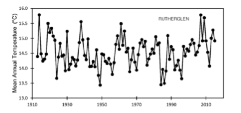
Though excellent, the Australian archives have not attracted as much attention in relation to analysis of climate change as one would have expected, although one study of a file of mostly inland, rural data found that a long cooling trend from the early years was replaced later in the century by warming “that is more pronounced where irrigation development for large-scale rice cultivation has occurred. Neither the cooling nor the magnitude of the recent warming can be explained by anthropogenic global warming theory’ [link]. The much-discussed temperature series from the Rutherglen agricultural research station in New South Wales conforms to this pattern, although the surrounding flat terrain of the Murray River valley is intensively planted in vineyards.
Here, the natural terrain has gone long ago – but the air temperature of the place conforms to the general pattern. Summer maximum temperatures were higher during the 1930s than today, and heavy bushfires in the surrounding region occurred on 13 January 1939 which became one of the series of ‘Black’ days of the week discussed earlier: that summer was 2.2oC hotter than any of the ten most recent summers at the same place.[link] Here are the GHCN-all data for Rutherglen.
But the original data have now been heavily revised by BoM. In particular, the series was broken at the 1939 maximum – which has disappeared – and a progressive warming has been imposed on the whole, based on homogenised data from other stations. The break was imposed because at that time the instruments had been moved ‘from one paddock to another’.
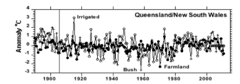
The original Rutherglen data resemble those of a cluster of 34 very rural GISTEMP stations in Queensland and NSW, chosen several years ago and selected for their length and continuity of record.
Each place was examined in satellite imagery to check the nature of the terrain immediately surrounding it, and its relative isolation; several potential candidates for inclusion were rejected on the grounds of excessive development of building around the likely placement of the instruments. Most are very small communities, so conditions are dominated by the surrounding outback environment, which is subject to very long dry spells. Land-use change has been small, many of the sites being in flat grassland with some cattle and scattered small trees and dry rocky terrain, some including a few small fields of cereals: at just three there was irrigated farming: only one is within 50 km of the coast.
Here, as in the rural-dominated USA network, the influence of urbanisation is small, and consequently there is no progressive 20th century warming. The outlying data points in the following plot, both warm and cool, are dominated by those places with some irrigation-fed farming, using rainwater accumulated behind a small earth dam; here the original bush environment has been degraded more than elsewhere. The curious jump around 1980 has been observed in other data: it awaits explanation; the vertical line indicates standardisation to Stevenson screens.
This pattern – and that of Rutherglen – is supported by yet another multi-station selection of unadjusted GHCN data, this time of a rectangle in NSW and Victoria; the pattern recalls the very long record from Adelaide, which is located in the same region. This provides further confirmation that the end of the 19th century was at least a warm as today in New South Wales in the original observations.
So the evidence is good that the climate of the vast inland regions of Australia changed very slowly during the 20th century, cooling progressively from the warm end of the 19th century and then gently warming again from the 1970s until the present time – which probably remains cooler than in 1900. Note
But all that remains hidden from most climatologists (and from The Guardian’s correspondent) because of progressive adjustment of the temperature data by NOAA, NASA and the BoM. This supposedly corrects the data for the progressive transformation of the site and, in so doing, replaces the rather stable climate of Alice Springs as recorded by the observers (solid symbols) into a secular warming trend (open symbols). This is now assumed to be correct, and is more acceptable because it supports modeled results of CO2 pollution of the atmosphere.
We can be sure that progressive warming here is a product of progressive adjusting of the data at NOAA and NASA, and not of CO2 pollution, because we have very good information concerning instrument moves.
At Alice Springs, the Stevenson screen has been located at four sites since 1890: (1) the telegraph office in open bush country, (2) the post office in town, (3) at a first airport site and (4) at a second airport site, where it remains. But, unfortunately for the adjusted 2018 data, the four segments of the original data match perfectly, indicate no progressive warming, and resemble the pattern from six appropriate rural stations: Giles, Tennant Creek, Urandangi, Boulia, Oodonata and Hall’s Creek. [link]
All this should have become a major scandal, but it appears to be of no concern to today’s climatologists, who almost unanimously accept the CRUTEM and GISTEMP archives as being correct. But the ‘adjustment’ of the original observations by NASA Goddard and the CRU is akin to the action of a museum systematist who squashes a beetle specimen underfoot because it upsets the nice tidy classification of its genus or family on which he (or she) is the sole expert.
It is now about 70 years since I learned my how profession functioned, and became involved myself in peer-reviewed science, but until recently I had not encountered anything that I personally judged to be off-colour – not so much as a squashed beetle.
Yet the imposition of warming trends, where there were none in the original data, by meteorological agencies in the USA and Britain is squashed beetles in spades and has become an essential support of the feeding frenzy that has gripped oceanographic (and other) research institutes everywhere, and in which I participated thoughtlessly in the 1990s. [link]
It is not very surprising then if the products of the Australian Bureau of Meteorology (BoM) were used – whether fortuitously or not – to support the political initiative of a Labour government that in 2012 introduced a cap-and-trade carbon tax which turned out to be as short-lived as the government itself. This editing of Australian data has generated a consistent, continental warming trend throughout the 20th century that is not present in the original data submitted by Australia to WMO in the past, and which now reside in the GHCN-all archive.
The latest version, ACORN 2, of 112 selected stations, reports the BoM, “shows that Australia has warmed by approximately one degree since 1910. The warming has occurred mostly since 1950. The frequency of daily temperature extremes has also changed since 1910. The number of weather stations recording very warm night-time temperatures and the frequency with which these occur has increased since the mid 1970s. The rate of very hot daytime temperatures has been increasing since the 1990s”.
In the technical description of ACORN-SAT on the BOM site, I can find no explanation of the abrupt change in slope around 1950, nor does there appear to be any such change in the state of the relevant drivers of Australian climate: ENSO index, Indian Ocean dipole, or in the Antarctic Ocean. Concerning this change of slope, IPCC reviewers cite CO2-forcing as sole the source of increasing temperature and consequent drought. [link] In any event, for reasons that must seem good to them, the BoM has removed all reference to years earlier than 1910 from the ACORN-SAT data. This is unfortunate, because it is perfectly clear from the historical record that devastating droughts and bushfires are not novel, CO2-forced events, but have been suffered – and were recorded – by settlers in Australia since the earliest days.
There has been some formal agitation for an official audit of the revision of its archived data held by the BOM [link], although this seems unlikely to be implemented. Fortunately, however, help is at hand, because six concerned individuals, the WA Climate group, has performed such an audit and posted the results in a series of consultable documents:
- – ACORN 2 influence on Australian temperature trends
- – ACORN 2 changes to Australian temperature history
- – Australian very hot days show no extreme climate change
- – Average temperature trends across Western Australia (all 32 stations)
- – GISS raw and BOM High Quality adjusted temperature comparisons
- – Australia raw temperature trend audit of BoM HQ static
- – September 2016 coldest in SW Australia since 1897
The first of these offers, for each state, a review of the data of every station in the BoM archive, including analyses of rates of change per decade (back as far as data exist), a detailed catalogue of changes made at the observing site, plots of annual average maximum and minimum temperatures (with associated Excel spreadsheets) and so on. One of the Queensland stations is Bourke, also included in my selection of rural sites discussed above.
For this place, I discover that “Bourke 48013 has annual max temps back to 1878: 1878-1909 = 28.62C” and that “1989-1998 raw max averaged 27.33C and post AWS 2000-2009 averaged 28.27C”, and finally that ”Observations were originally made within the Bourke township (048013). This site had trees and buildings nearby and the lawn around the screen was regularly watered. There was a small site move within the Post Office yard in May 1937, and the screen was replaced in November 1964. A site (048239) was established on the southern side of the airport near the terminal building on 11 November 1994. Observations continued there until January 1999. The current site began operations in December 1998, 700 m north of the previous airport location but with only a minimal overlap. These data are used in ACORN-SAT from 1 January 1999.”
Yet Bourke, like all the rest of the ACORN stations, has been truncated at 1910 and what happened in the previous decades – for which we have good evidence of great heat and withering droughts – seems now to be of no concern to the BoM. Others have pointed to errors in observer’s records that have not been corrected, e.g. minimum daily temperatures that are higher than maximum, or significant rounding-up errors in transcription of observers logs.[link]
Finally, BoM failed to comment on the fact that the warming trend is largely restricted to night temperatures although this is characteristically associated with urbanisation; this is a very weak point in their argument, because the influence of urbanisation is not restricted to the passive radiative effects of buildings, but also to the consequences of the heat of combustion generated in situ by transportation, heating, and industry: this is a major, but habitually overlooked, factor in urban heat islands everywhere. [link]
So, what was the direct cause of the 2019 drought and firestorms?
Finally, what was the probable cause of the conditions that led to the 2019 drought and fire storms? Do we have to invoke anthropogenic CO2 as has been widely done, or is there a more parsimonious explanation?
In fact, conditions were ripe for a catastrophic fire season in 2019. The strong Niño of 2016 and the weaker event of 2019 had created a significant rainfall deficit: in 2018, rainfall over southeastern Australian mainland was in the lowest 10% of historical observations, particularly from April onwards. New South Wales was deep in drought by August 2018 and remained so until May 2019, when more than half of Queensland was also declared to be in drought. The BoM declared the drought to be worse than the Federation Drought, the WWII drought and the Millennium drought, but presented no evidence for that doubtful statement.
But that may not have been the most important factor in the fires. Fire reduction burning had been done in only 1% of the Victoria woodlands when at least 10% was required, according to the foresters, and previously agreed to by government. But the expert advisory committee described the governments reaction to their advice as “a farce, conveniently ambiguous and deceptive to the point of arrogance”. Consequently, there were dangerous fuel loads in in Victorian bush-lands and the members of the forest fire advisory group accused the Victoria government “of tacitly neglecting its commitments to fuel reduction to appease the green lobby”.
If you want to see the resultant conditions for yourself, take a drive on Google Earth up any small road in the hills of NSW or Victoria…you will see scorched trees, a thick layer of dead leaves and abundant underbush.
Given the rainfall deficit together with such conditions in the bushlands, accidents are inevitable and, together with the propensity of some people to arson, one needs to look no further for the cause of the unstoppable fires. Today, as I write this, the BBC is reporting that a volunteer firefighter of 19 has been arrested for seven counts of alleged arson in an area south of Sydney, NSW. And another arsonist finds himself charged with manslaughter.
* * * * * * * * *
So there is really no need to complicate things by the insertion of CO2 forcing into this rather sad story – which William of Occam suggested we shouldn’t do unless it was really essential.
But that means that if Graham Redfearn, who also writes for The Guardian, happens to see this text, I shall find myself accused of being another amateur of ‘conspiracy theories’ concerning the ‘corruption’ of archived temperature data by government agencies, along with Jennifer Marohasy and others. Redfearn suggests that scientists should accept the reasons put forward by the BoM for their revisions of the temperature archive and, of course, as a journalist he is entitled to express that opinion.
But investigative journalist he proves not to be, for he has obviously not read any of the material quoted here concerning the unfortunate revision of international archives of temperature data by some US and UK government agencies. The BoM is, of course, entitled to do what it think fit with its own data, although I happen to think they have not got it right.
Failure to understand the climatic and other causes of the Australian bush fires leads to failure of implementing sensible policies to ameliorate the situation.
Moderation note: As with all guest posts, please keep your comments civil and relevant.